Color characteristics
Any project that calls for the production of visuals, prints and displays or simply the creation of a new residential decor requires the determination of colors.
While some are imposed by imperatives related to a corporate signature or a commercial tradition, for example, others only ask to be selected and adopted. And that’s where a complex task begins: determining the appropriate colors that take into account countless criteria. All more important and relevant most of the time.
What can help creators, designers, or simply people who want a change of decor or mood, in the search for the perfect colors, is to know the various characteristics of the color.
Let us try to establish the main ones.
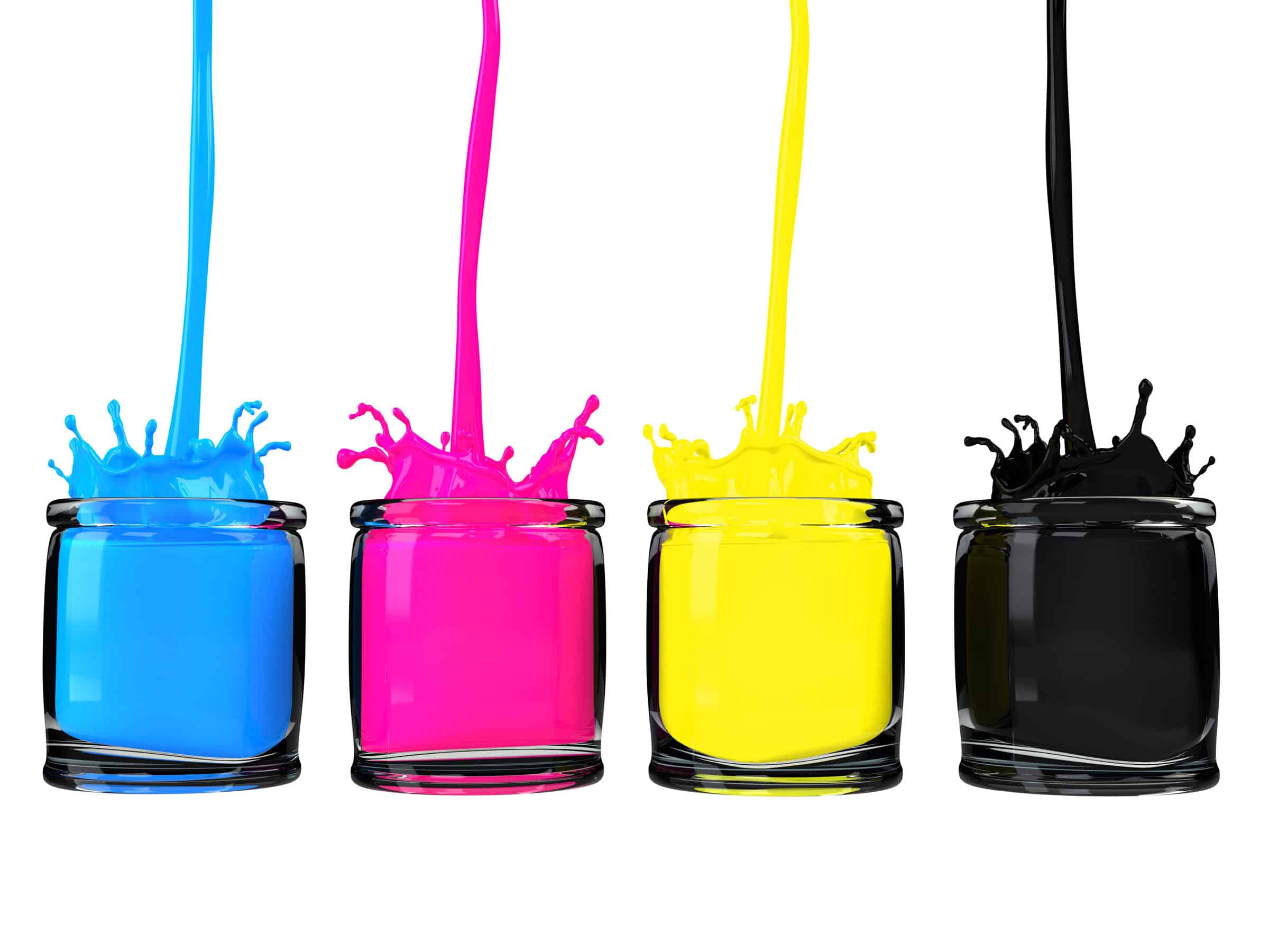
Color is therefore the association of three characteristics: luminosity, hue and saturation. It therefore becomes imperative to distinguish color and hue, which are often confused.
Moreover, the meaning of colors is a matter of psychology, biology and culture. Certain colors have a profound effect on us because they are very present in our surroundings (red, the color of fire, associated with heat, while green is associated with nature). In addition, bright colors attract more attention (poisonous plants and animals often display these colors). Thus, we will want to eat red fruits before green fruits, because ripe and sweet fruits are more often red than green.
For other colors, it is the cultural associations that count, such as the pink which has been attributed to girls and the blue to boys by Western societies (but this is less and less the case due to inclusion policies more and more widespread).

Science at the service of the senses
There is a complex science behind the perception of colors, and multiple factors influence how our visual faculty works. Because let’s face it, it’s a lot about the ability to see colors taking into account the various environments that influence it.
Differences in perception can sometimes cause disagreements between people. However, if the accuracy and color consistency of a product are critical to a business’s success, for example, ignoring these differences can be costly.
Of course, this is not an exact science. Your audience will surely have personal preferences that go beyond biology and the cultural imagination. And you would do well to take this into account when choosing colors for your brand, decor, promotional products, giant signs, or whatever else you decide to produce for the marketing of your projects whatever they are.
Four levels are involved in determining the color.
- The nature of the light source is the first of these levels. You need a suitable light source, in intensity and in kind. In the dark, impossible to determine the exact shade. Blue lighting or red lighting completely changes the effect. It is the same with lighting by incandescent lamp or a neon tube, which insidiously modifies our choice of color compared to a choice made in daylight.
- The second level is the observed object. It can be extremely complex, associating several colors, its transparency and its surface finish which will disturb the choice. The light reflected or transmitted by the object to the sensor, the eye, depends on the nature of the source.
- The eye is the third level. It captures through its sensory cells, rods and cones, a limited part of the photons. This is the visible spectrum. It transmits information to the center of vision, at the level of the occipital cortex.
- The fourth and last level corresponds to this occipital cortex where the transmitted information will be collected and analyzed.
So, now instilled in the main principles of color, your ideas, your palettes, and go! You can also let our advisors help you make the best choice.